Deliverables
Stakeholder interview Analytics review Competitive review IA recommendation Wireframes
Lessons Learned
The strategic value of IA Figjam for collaboration
Background
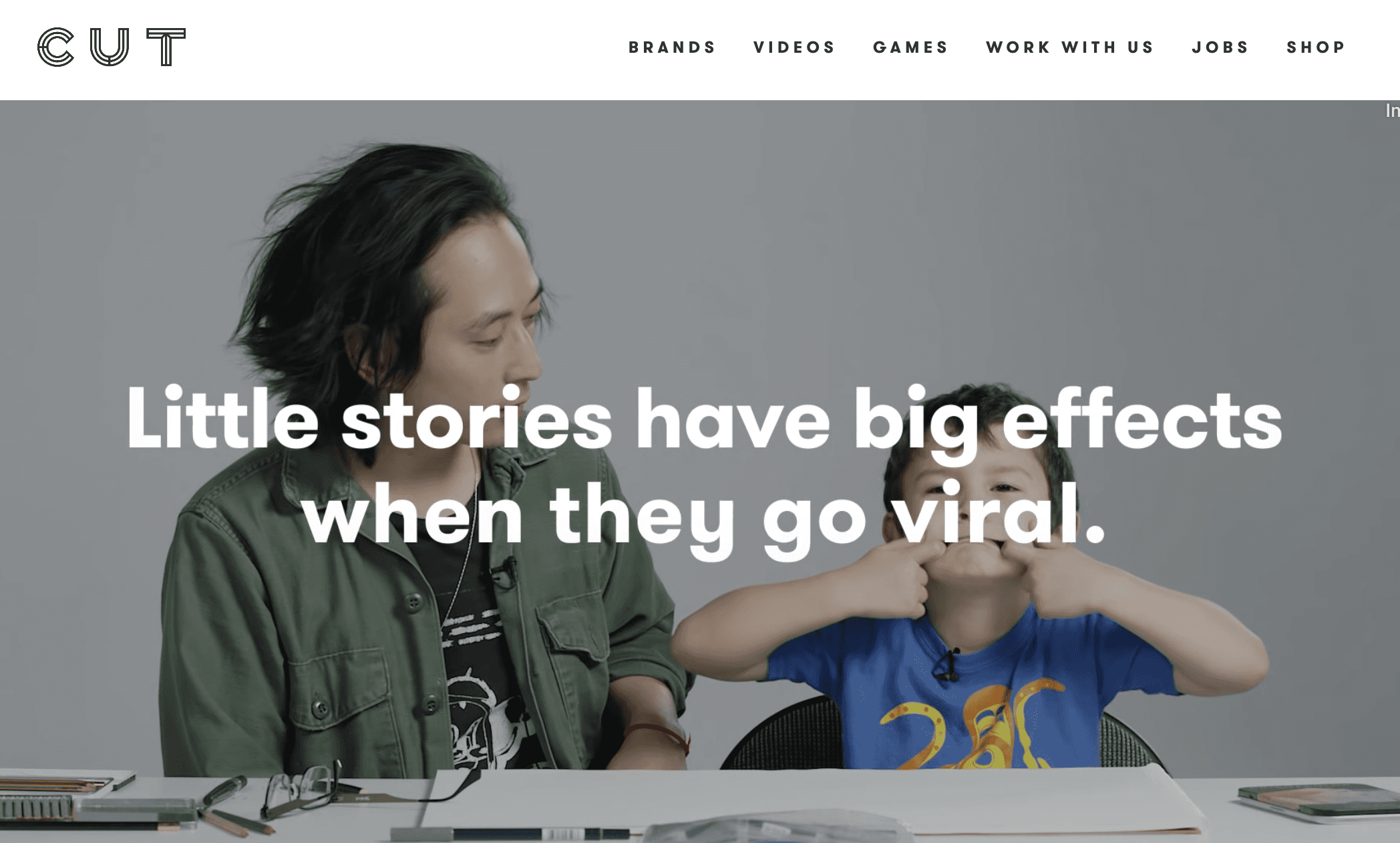
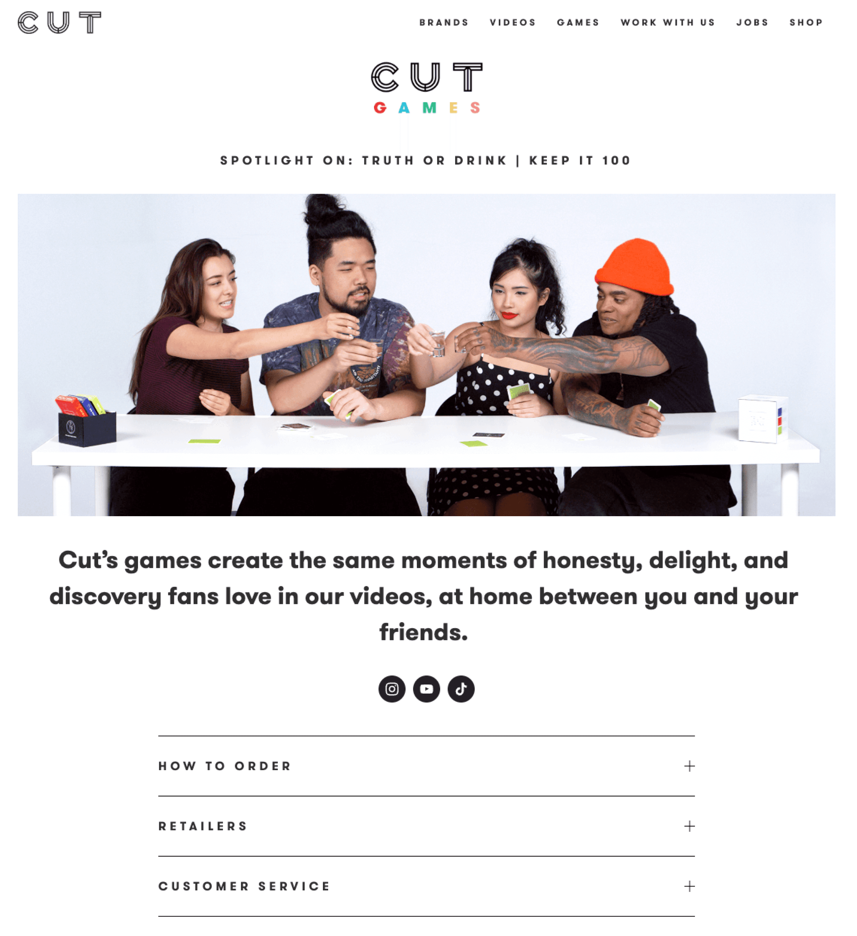
Cut is a storytelling media organization with the tagline “Cut is for everyone.” Through their YouTube channels, they present heartfelt and compelling video content. Their brand website provides users a springboard to this content, as well as board games and accompanying merchandise. The ask was to review Cut's website experience and help them reevaluate their information architecture to support their different brands and content needs.
The Work
Cut's ambitiously wide breadth of an audience for their video content (“everyone”) wasn’t far from the truth for their website either - it was serving some widely different users with varying goals.
Video viewers - browse and consume video content (per 3x brands)
Board gamers - browse available games, learn how to purchase
Shoppers - browse and purchase merchandise
Prospective investors - learn about the business, find contact information
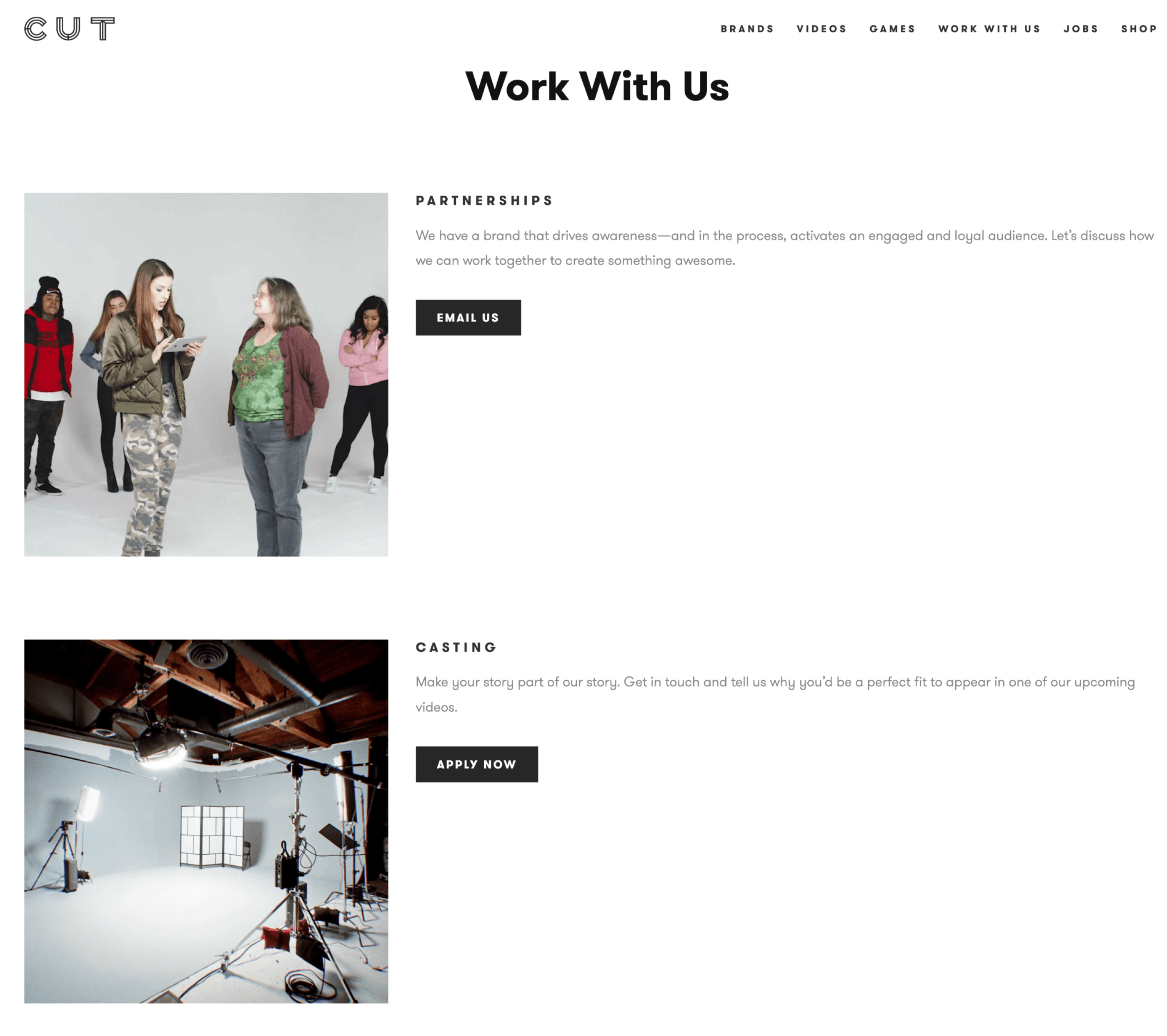
Prospective actors - apply for roles
Prospective employees - apply for roles
From a business standpoint, Cut had grown from its successful YouTube channels into multiple brands of videos, board games, as well as merchandise for each brand. The website needed to support existing content, as well as set themselves up for scaling into the future.
Discovery
First, I asked the business questions about their overall goals as well as their understanding of the top tasks they thought users might perform on their website. Analytics data was reviewed to understand traffic sources, which areas of the site were getting the most traffic and engagement, and which areas of the store were performing the best in terms of e-commerce conversion rate metrics. I also reviewed other media websites to understand how they might approach similar scalability problems.
Design
At a high level, the proposed design included these recommendations for improvement:
Design for varying audience differences and user goals between the primary website, social media, and the merchandise store
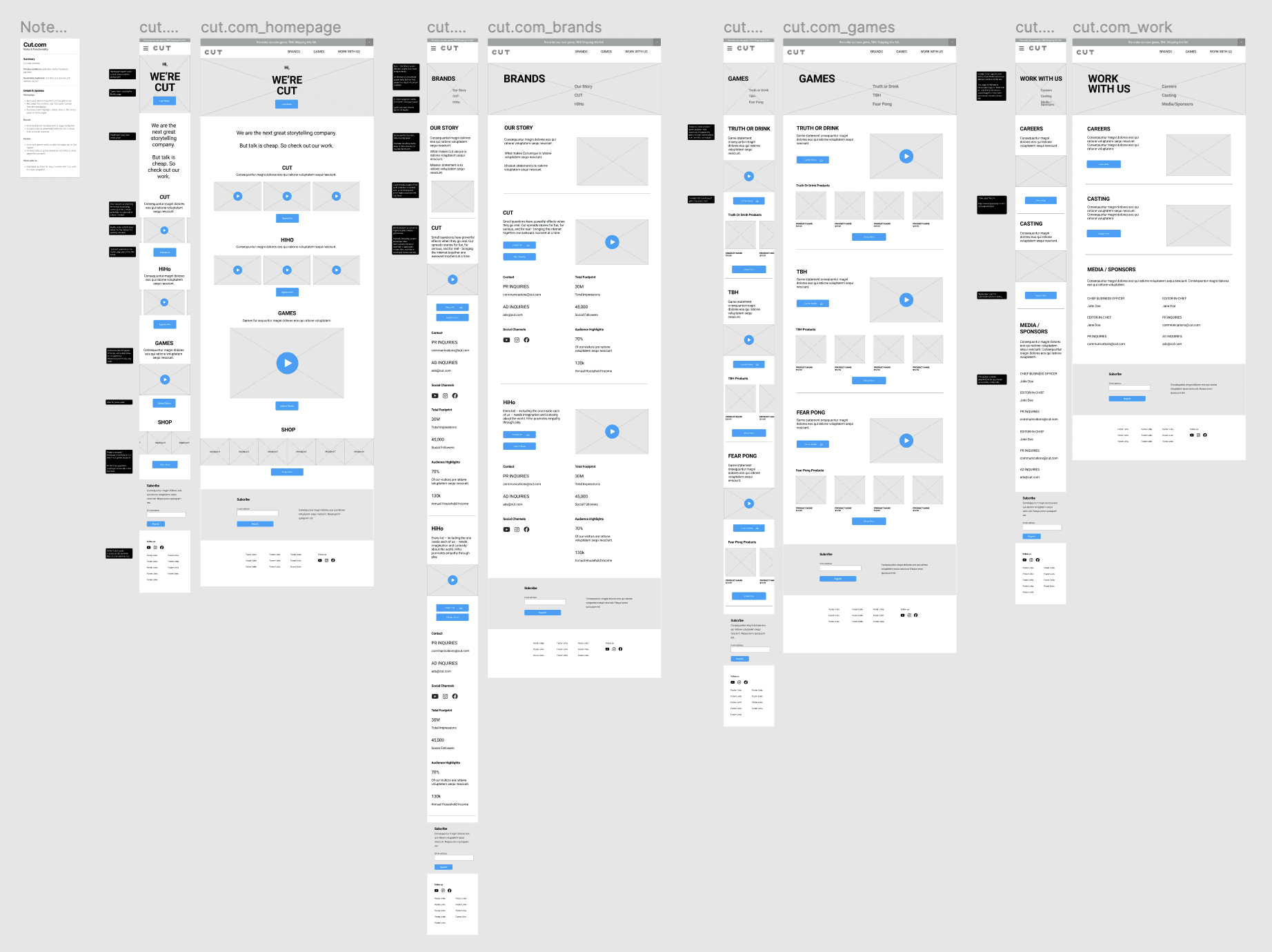
Revise the menu to align to users top tasks (discovery of brands, games, and ways to work with Cut)
Remove "Watch" page, as users are already doing this on YouTube
Prioritize best-selling and primary product categories as the focus in the shop page
Deliverables included a sitemap and wireframes, which helped serve as a communication tool, fostered the discussion, and led to the eventual outcome of a more usable and navigable website IA. The site updates allowed users to more easily navigate, and helped the Cut organization more efficiently host content as they scale their business. A high level look at the wires and sitemap:

